
Some homes announce their price tag the moment you walk in. Others are quieter about it, letting small, deliberate choices do the talking instead of chandeliers or marble everywhere. The real tells of expensive taste tend to be subtle: a certain hardware finish, the way light falls across a room, or the restraint to leave a wall bare when a lesser design instinct would fill it. These are the details that design-savvy homeowners obsess over, even when nobody else notices right away.
1. Solid wood doors instead of hollow ones
1. Solid wood doors instead of hollow ones (Image Credits: Unsplash)
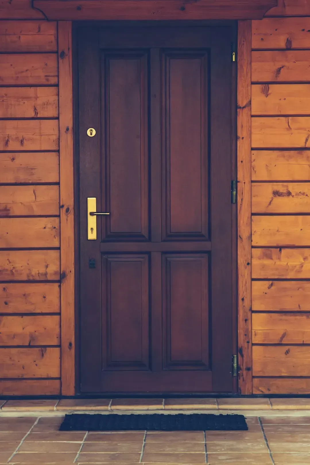
Knock on an interior door and you can usually tell a lot about a house. Hollow-core doors sound tinny and light, while solid wood or solid-core doors have a dense, muted thud that signals quality construction. Homeowners with refined taste often replace builder-grade doors early, since they affect both the acoustics and the tactile feel of a home every single day.
This upgrade rarely shows up in photos, which is exactly why it matters. It is not for guests to admire, it is for the homeowner to enjoy quietly, every time a door closes with a satisfying weight instead of a hollow clack.
2. Unlacquered brass hardware that ages naturally

2. Unlacquered brass hardware that ages naturally (By Mauro Cateb, <a href="https://commons.wikimedia.org/w/index.php?curid=40350919" target="_blank" rel="noopener">CC BY-SA 4.0</a>)
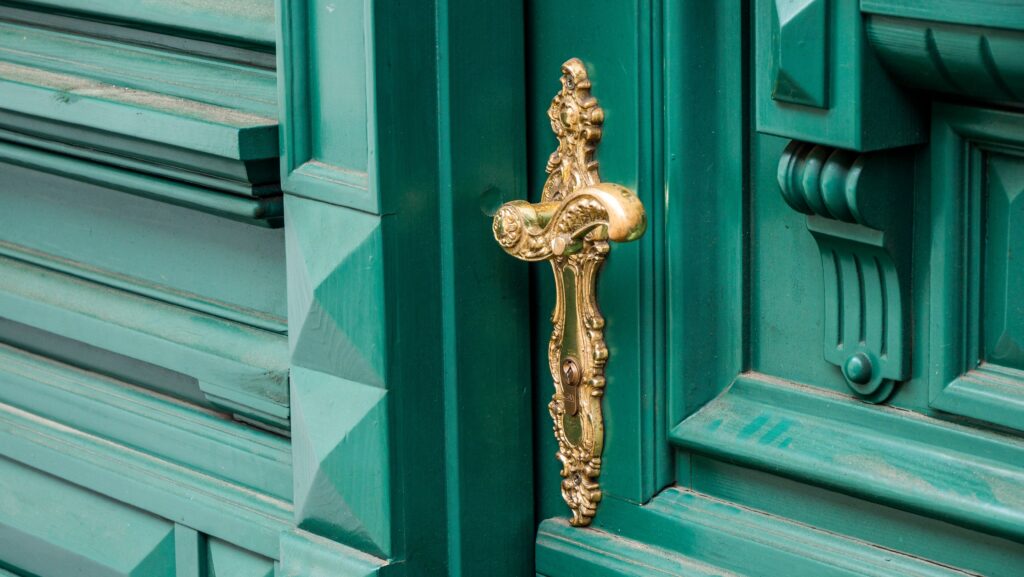
Unlacquered brass has become a favorite among people who understand patina rather than fear it. Unlike chrome or polished lacquered brass, unlacquered versions darken and develop character over years of handling, which is precisely the point. It signals a homeowner who is playing a long game with their interiors rather than chasing a trend that will look dated in five years.
This choice also tends to appear alongside other historically-informed details, like reeded glass cabinets or vintage-inspired faucets. It is a small hardware decision, but it reveals a homeowner who has done research and cares about how materials evolve, not just how they look on installation day.
3. Integrated appliances that disappear into cabinetry
3. Integrated appliances that disappear into cabinetry (Image Credits: Unsplash)
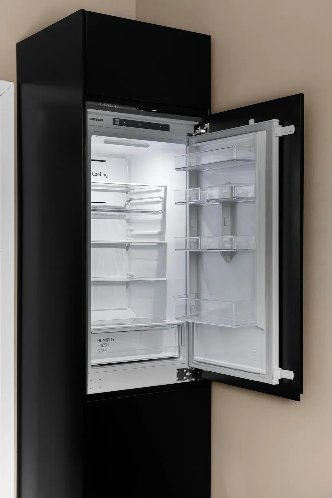
A refrigerator or dishwasher with a panel front that matches the surrounding cabinetry costs noticeably more than a standard stainless steel version, both in the appliance itself and the custom paneling required. Homeowners who choose this route are prioritizing a seamless, uncluttered look over showing off brand names or stainless finishes. It is a detail most visitors will not consciously register, they will just sense that the kitchen feels calmer.
This approach also requires more planning during a renovation, since panel-ready appliances need to be specified early and coordinated with a cabinet maker. That extra layer of foresight, often invisible to anyone but the homeowner and their designer, is itself a quiet marker of taste and budget.
4. Thoughtfully placed lighting instead of one central fixture
4. Thoughtfully placed lighting instead of one central fixture (Image Credits: Unsplash)
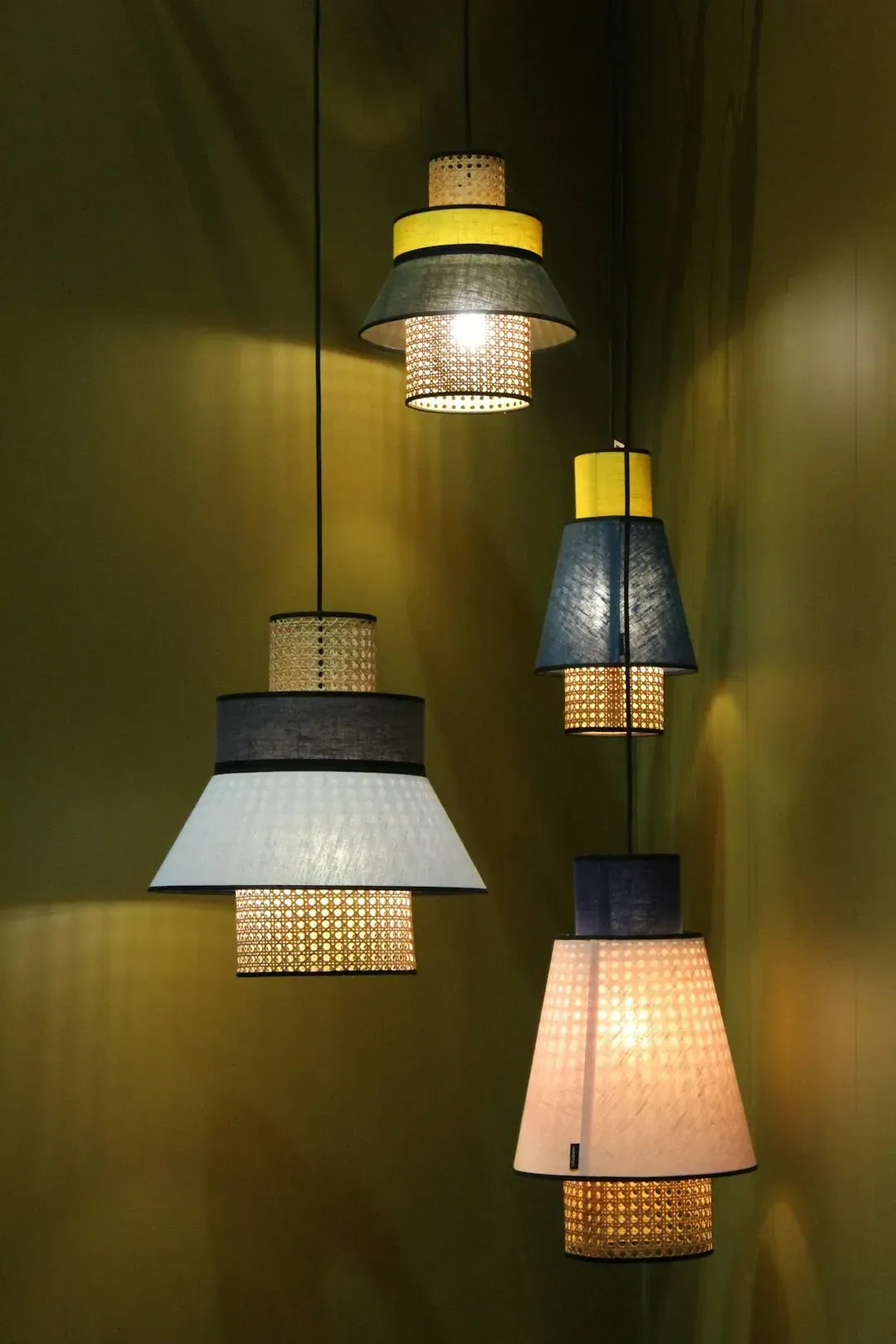
Relying on a single overhead light in every room is one of the fastest ways to make a space feel flat and generic. Homes with expensive taste usually layer lighting: recessed cans for general illumination, sconces or picture lights for accent, and lamps for warmth at eye level. This layering takes more planning, more electrical work, and more fixtures, which adds cost but transforms how a room actually feels in the evening.
Dimmers on nearly every switch are another quiet giveaway. It is a small technical detail, but it lets a homeowner shift a room’s mood depending on the time of day, something builder-grade lighting rarely allows for.
5. Wide-plank or herringbone hardwood floors
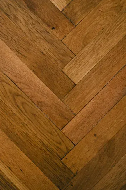
5. Wide-plank or herringbone hardwood floors (Image Credits: Pexels)
Standard strip flooring, typically narrow boards in repetitive rows, is the default in most production homes because it is efficient to install and forgiving of subfloor imperfections. Wide-plank hardwood or herringbone patterns cost considerably more, partly due to material waste and partly due to the skilled labor required for precise installation. Homeowners who choose these patterns are often willing to pay a premium for a floor that reads as intentional rather than incidental.
Herringbone in particular has surged in popularity in higher-end renovations over the past few years, especially in kitchens and entryways. It is a detail that photographs beautifully, but its real value is felt underfoot, in how solid and considered the space feels.
6. Plaster or limewash walls instead of standard paint
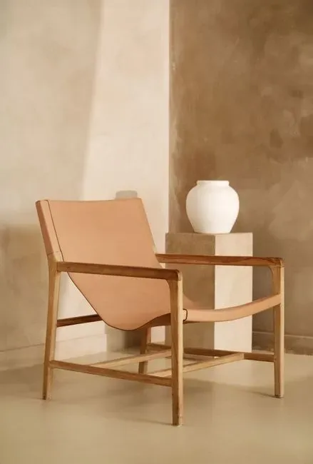
6. Plaster or limewash walls instead of standard paint (Image Credits: Pexels)
Traditional plaster and limewash finishes have made a strong comeback in upscale renovations, largely because they create subtle texture and depth that flat paint simply cannot replicate. These finishes are applied by hand, often by specialized tradespeople, which makes them considerably more labor-intensive and costly than a few coats of paint. The result is a wall that shifts slightly in tone depending on the light, giving a room a sense of depth rather than a flat, uniform surface.
Homeowners drawn to these finishes are often thinking in terms of longevity and atmosphere rather than quick refreshes. It is a feature that rewards close attention, the kind only a homeowner who lives with the wall every day would truly appreciate.
7. Custom millwork and built-ins
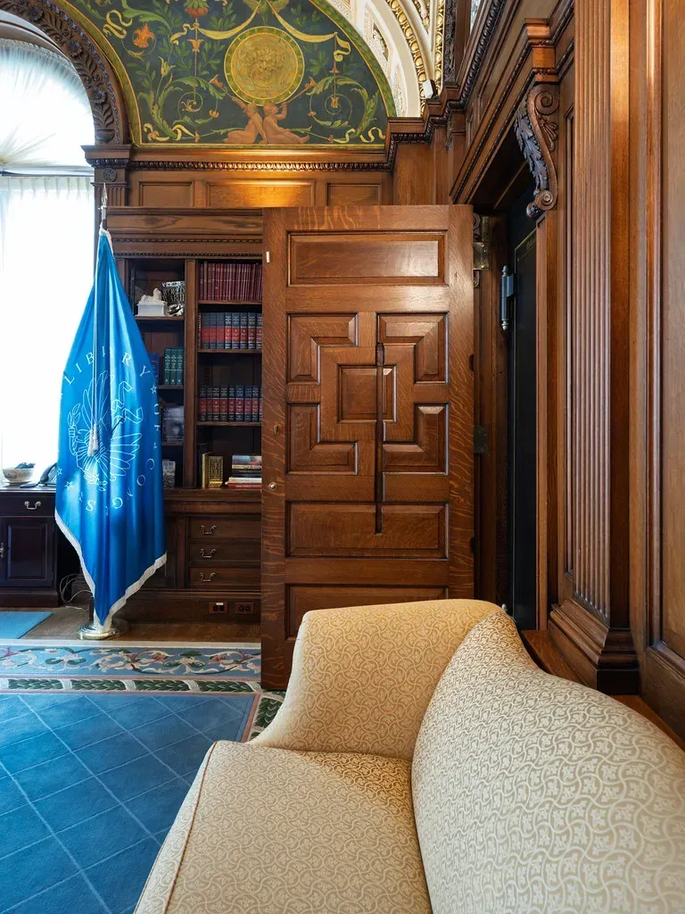
7. Custom millwork and built-ins (dalecruse, Flickr, <a href="https://creativecommons.org/licenses/by/2.0/" target="_blank" rel="noopener">CC BY 2.0</a>)
Built-in bookshelves, window seats, and paneled walls that are designed to fit a specific room, rather than assembled from off-the-shelf units, require a carpenter or millwork shop and considerably more planning time. This custom approach means every inch of a room is used deliberately, with no gaps or mismatched proportions that come from fitting generic furniture into an unusual space. It is one of the clearest signs of a homeowner who worked closely with a designer or architect rather than furnishing a room after the fact.
Custom millwork also tends to hide practical needs, like electronics or storage, behind seamless panels. The homeowner gets both function and a cleaner visual line, a combination that is difficult and expensive to achieve with prefabricated furniture.
8. Natural stone instead of engineered alternatives
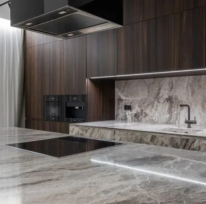
8. Natural stone instead of engineered alternatives (Image Credits: Pexels)
Engineered quartz and laminate countertops have become the default in most renovations because they are durable, consistent, and less expensive than natural stone. Homeowners who choose marble, soapstone, or honed granite are often accepting more maintenance and a higher price per square foot in exchange for the natural variation and depth that only quarried stone provides. Every slab is different, and that unpredictability is part of the appeal for people drawn to authenticity over uniformity.
Marble in particular etches and stains over time, which some homeowners see as a flaw and others see as a feature that tells the story of daily life in the kitchen. Choosing it anyway, knowing it will age visibly, is its own quiet statement about priorities.
9. Window treatments that are floor-to-ceiling and fully lined
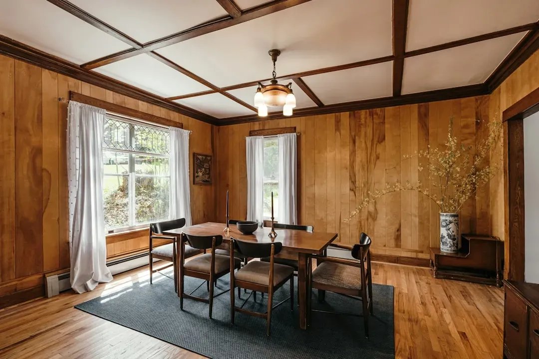
9. Window treatments that are floor-to-ceiling and fully lined (Image Credits: Unsplash)
Short curtains or basic blinds are common in most homes because they are inexpensive and simple to install. Floor-to-ceiling drapery, especially when interlined for both light control and a fuller drape, requires custom measuring, more fabric, and professional installation, all of which raise the cost significantly. The visual effect, however, is dramatic, making ceilings feel taller and rooms feel more finished.
Homeowners with an eye for detail also tend to be particular about the hardware, choosing substantial rods and rings over the thin, adjustable versions sold in most home goods stores. It is a detail that shapes the entire feel of a room, even though most guests would struggle to explain exactly why the window looks so good.
10. A dedicated mudroom or drop zone near the entry
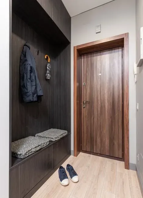
10. A dedicated mudroom or drop zone near the entry (Image Credits: Pexels)
A functional mudroom, complete with built-in cubbies, a bench, and hidden storage for shoes and bags, is a feature that takes real square footage and planning to execute well. Many production homes skip this entirely, leaving homeowners to improvise storage near a side door or garage entrance. Investing in a proper mudroom signals a homeowner who is thinking about daily function just as much as visual polish, since it is one of the least glamorous but most frequently used spaces in a home.
This kind of space also tends to be finished with the same level of detail as more visible rooms, including good lighting, durable flooring, and considered storage. That consistency, applying the same design standards to an entryway as to a living room, is a subtle marker of a homeowner who does not cut corners in less visible spaces.
11. Landscaping that looks effortless but is not
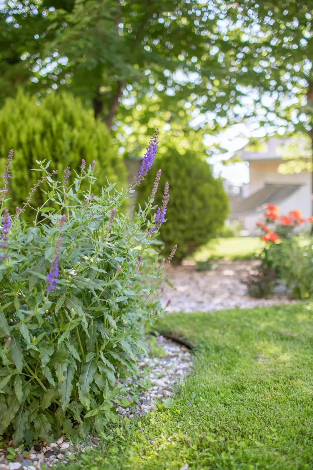
11. Landscaping that looks effortless but is not (Image Credits: Unsplash)
A yard that appears naturally lush, with layered plantings, mature trees, and a lawn that stays green through changing seasons, is almost always the product of ongoing professional maintenance and an initial investment in mature landscaping rather than starter plants. Homeowners with expensive taste often extend their attention to detail outdoors, treating the landscape as an extension of the home’s interior design rather than an afterthought. This can include irrigation systems, seasonal plantings, and hardscaping like natural stone pathways that are chosen to complement the architecture of the house.
The giveaway is usually the absence of obvious effort. Overgrown or patchy yards read as neglect, while a well-kept but natural-looking landscape suggests ongoing care and a budget set aside specifically for it, even if that budget is never discussed.
Taken together, these features rarely shout for attention on their own. They tend to show up in combination, layered lighting alongside solid doors, natural stone next to custom millwork, forming a home that feels considered rather than assembled. The common thread is patience: choosing materials and details that age well, function quietly, and were never meant to impress anyone but the person living there.