
The kitchen sells the house, or at least that's what agents keep saying at open houses across the country. Yet the same room that closes deals can also quietly kill them, and it's rarely the big, obvious flaws that do the damage. It's usually something smaller: a finish, a feature, a layout choice that seemed clever a few years back but now makes buyers hesitate without them fully realizing why.
1. Over-the-range microwaves
1. Over-the-range microwaves (Image Credits: Unsplash)
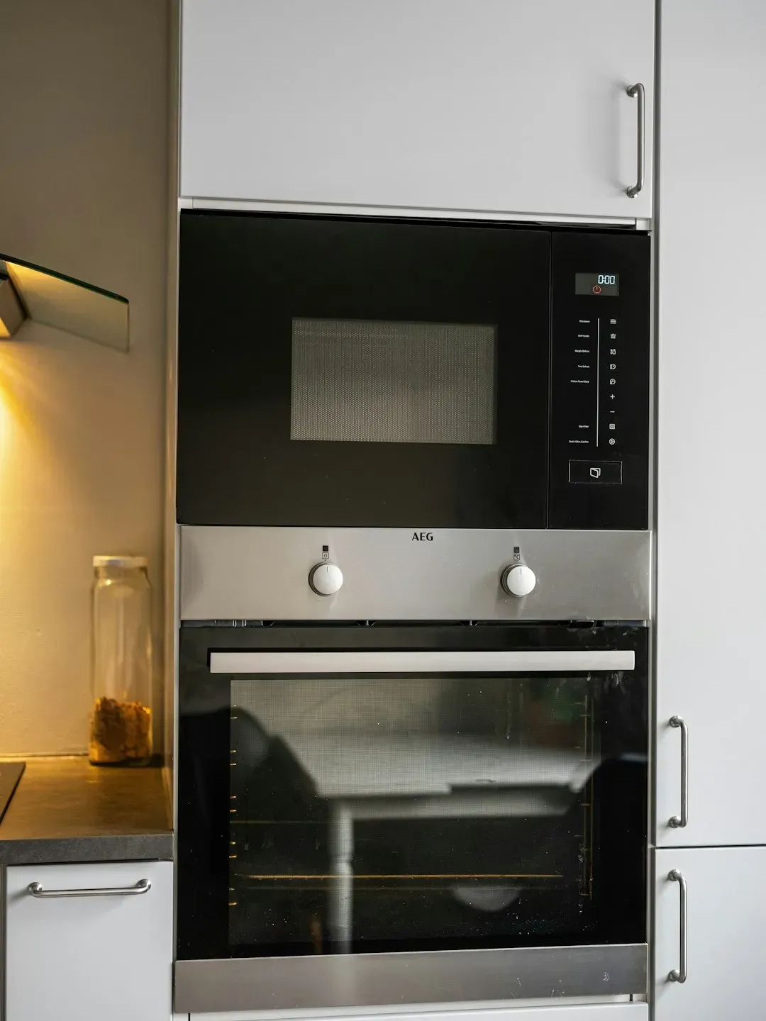
For a long stretch, mounting the microwave above the stove felt like a smart way to save counter space. For years, over-the-range microwaves were seen as a smart space-saving solution, but many homeowners now dislike how quickly they become coated with grease and how they often provide less effective ventilation than a dedicated range hood.
Buyers walking through a kitchen with one of these units often see it as a project waiting to happen. It signals weaker ventilation and an appliance that will need grease-cutting attention far more often than a proper hood ever would.
2. Touchless faucets
2. Touchless faucets (Image Credits: Pexels)
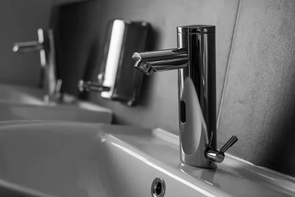
These gadgets sound like a dream when your hands are full of raw chicken or cookie dough. In reality, many homeowners report inconsistent sensors, accidental activations, and maintenance headaches that make a traditional faucet seem much more appealing.
During a showing, a faucet that turns on randomly or ignores a hand wave entirely doesn’t read as high tech. It reads as unreliable, and unreliable is not a word anyone wants attached to their kitchen.
3. All-white everything
3. All-white everything (Image Credits: Pexels)
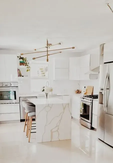
All-white kitchens dominated design boards for years, promising a bright, clean, gallery-like feel. Many homeowners are finding them difficult to live with, since every fingerprint, spill, splash, and smudge seems to stand out, turning routine maintenance into a constant battle.
All-white kitchens are not disappearing, but many people feel the fully white version has reached saturation. Buyers touring a spotless white kitchen may admire the photos online, then quietly picture their own family’s daily mess taking over the space within a week.
4. Open shelving in place of real storage
4. Open shelving in place of real storage (Image Credits: Unsplash)
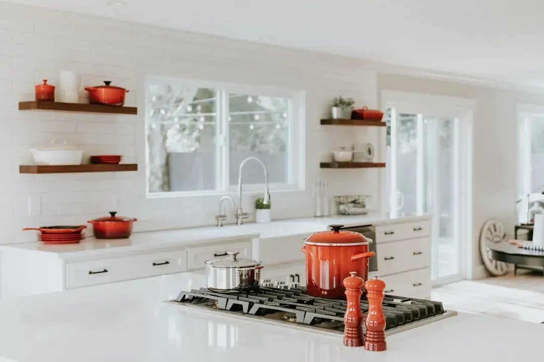
Open shelves photograph beautifully, styled with a handful of ceramic bowls and a plant. Many liked the look in photos but disliked living with it, with dust, grease, limited storage, and visual clutter as common complaints, and several homeowners said they would not remove functional cabinets for open shelves again.
This isn’t just an internet opinion either. Open shelving once promised a breezy, minimalist look, but in reality, it often leads to clutter and constant dusting, and by 2025, this trend signals an outdated kitchen because people want practical storage that hides messes and keeps things organized. Buyers notice the missing cabinet doors before they notice the styling, and most walk away thinking about where they’d actually put their dishes.
5. Cool gray cabinetry
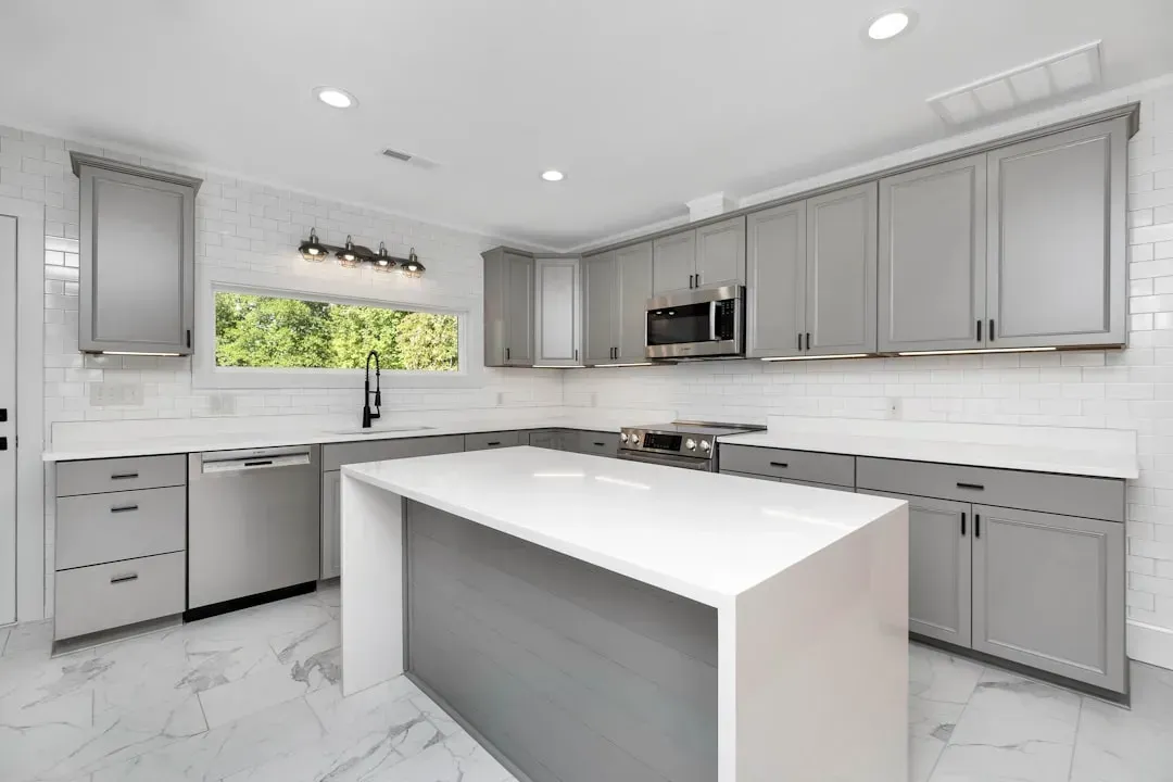
5. Cool gray cabinetry (Image Credits: Unsplash)
Gray had a long, comfortable run as the safest possible cabinet choice. Today, many homeowners feel the color lacks warmth and personality compared to richer greens, earthy browns, warm woods, and other inviting tones.
The shift shows up in the numbers too. Neutral, unpainted wooden cabinets are growing in popularity according to more than half of surveyed homeowners, and roughly half say white oak is emerging as the most in-demand wood type. A kitchen still leaning on flat gray can feel a step behind to buyers who’ve spent time browsing current listings.
6. Harsh black and white contrast
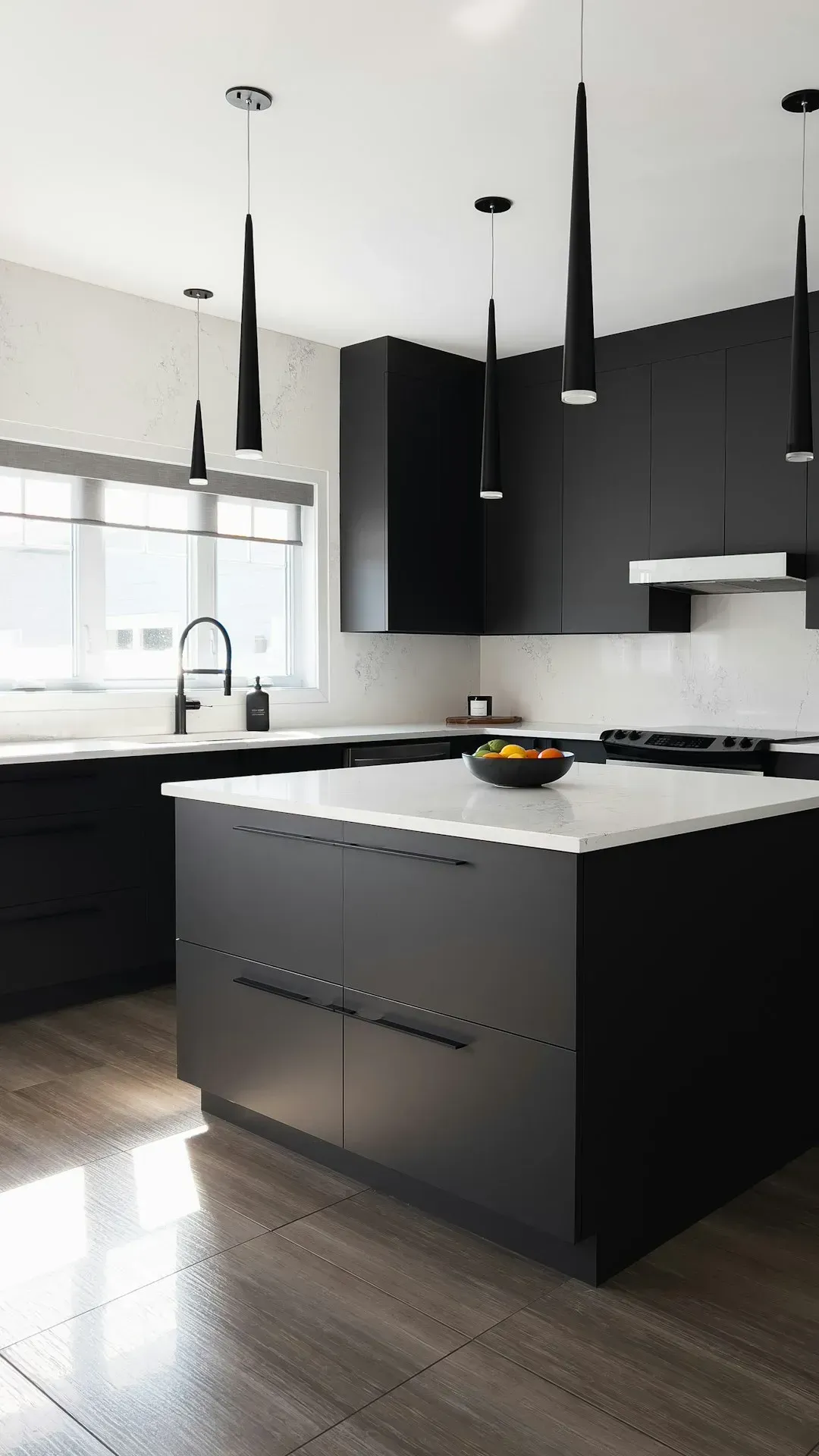
6. Harsh black and white contrast (Image Credits: Unsplash)
High-contrast kitchens, think stark white cabinets paired with matte black fixtures, once looked sharp and modern. Harsh, high-contrast black and white looks modern, but that’s not what buyers are gravitating toward these days, since what used to feel clean and crisp now feels sterile and dated.
Matte black hardware in particular has become a flashpoint. One real estate investor noted that matte black hardware can feel overdone, and if applied everywhere, it can read as too trend-driven rather than timeless. Buyers may not name the feeling exactly, but a kitchen that looks like a showroom photo from several years ago tends to land as dated rather than fresh.
7. Oversized, impractical islands
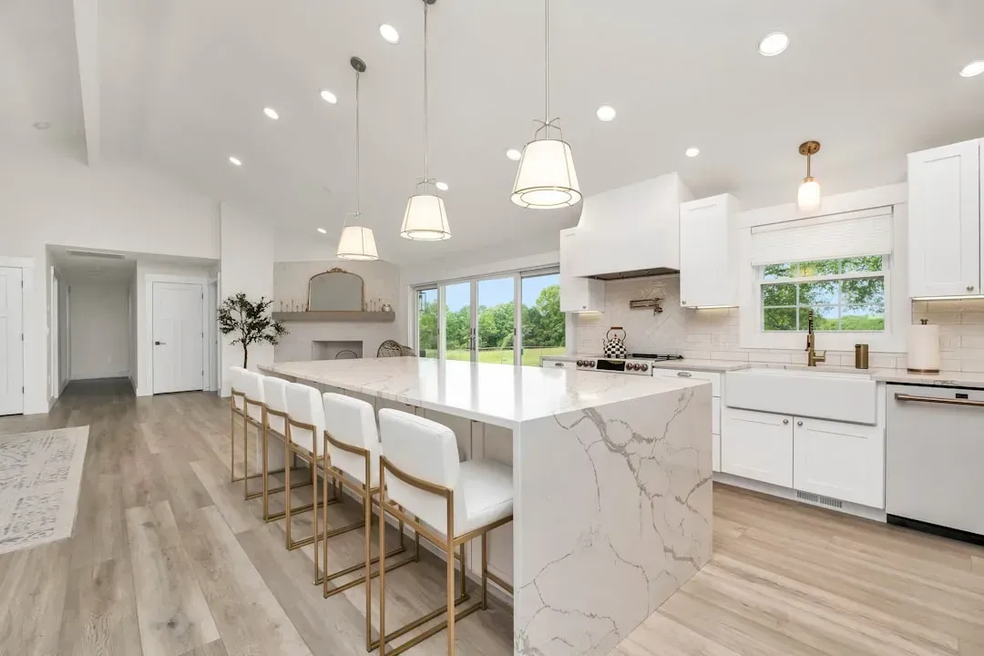
7. Oversized, impractical islands (Image Credits: Unsplash)
Bigger seemed better for a while, and plenty of homeowners went all in on massive kitchen islands. There are several outdated kitchen island trends that homeowners are regretting having bought into, but one of the most potentially frustrating is investing in an oversized island, which on the face of things seems like a good idea because it gives extra prep space plus room for kids and guests to sit around.
The problem shows up when the room needs to flex. While they seem to offer lots of benefits, oversized islands also soak up lots of space and can actually make a kitchen less versatile for different scenarios, like hosting a holiday gathering where everyone needs room. Buyers walking around a comically large island often clock the wasted floor space before they appreciate the extra counter room.
8. Waterfall countertop islands
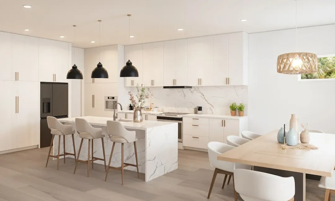
8. Waterfall countertop islands (Image Credits: Unsplash)
The waterfall edge, where the countertop material drapes down the sides of an island in one continuous slab, had a dramatic run in high-end renovations. Waterfall islands sparked strong reactions, and while some still like them, many see them as a trend that peaked quickly, with the most common criticism focused on wasted material and the sense that the choice was driven by fashion rather than need or layout.
It’s an expensive detail to reverse, which makes buyers cautious rather than impressed. A feature that reads as a costly stylistic flourish rather than a functional upgrade tends to raise questions about resale value down the line.
9. Patterned, high-maintenance backsplashes

9. Patterned, high-maintenance backsplashes (By Capdevielle, <a href="https://commons.wikimedia.org/w/index.php?curid=26623241" target="_blank" rel="noopener">CC BY-SA 3.0</a>)
Bold, patterned backsplashes had their moment, from busy glass mosaics to farmhouse-style tile designs. There was a time when patterned backsplashes were all the rage, from vibrant glass mosaics to farmhouse patterns that felt of the moment, but now they feel dated and high-maintenance.
Real estate investor Jackie Coffey put it plainly: buyers see trendy patterned tile backsplashes and immediately think about remodel costs, and those choices limit the audience because what you love today could turn off half of your buyers tomorrow. A simpler, larger-format tile or natural stone tends to age far better and worries fewer buyers.
10. Farmhouse details in the wrong house
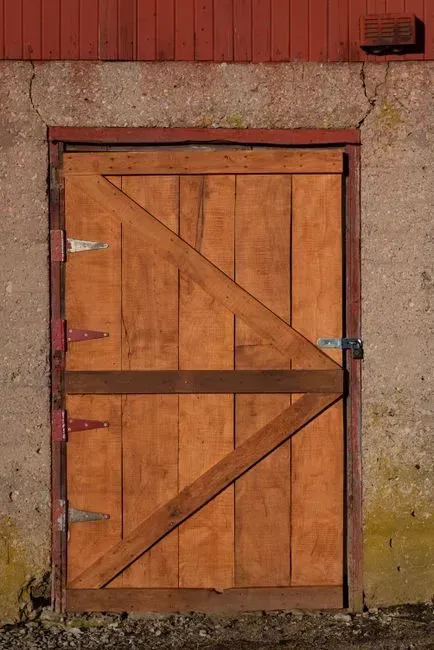
10. Farmhouse details in the wrong house (Image Credits: Pexels)
Farmhouse style itself isn’t the issue. It’s farmhouse details bolted onto homes where they simply don’t fit. The issue was not farmhouse style itself, but farmhouse details added to homes where they do not belong, with barn doors, rustic finishes, and themed decor in mid-century or modern houses described as mismatched and difficult to reverse.
Barn doors are the most visible offender. Barn doors were a hit for bringing rustic charm indoors, but their widespread use has made them feel overdone. Buyers touring a sleek, contemporary home with a rustic barn door slapped onto the pantry tend to notice the mismatch immediately, and it rarely reads as charming.
11. A kitchen that's too open to everything else
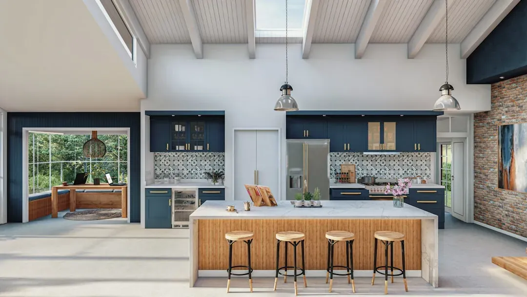
11. A kitchen that's too open to everything else (Image Credits: Unsplash)
Fully open floor plans were the gold standard for over a decade, but the pendulum is swinging back toward some sense of division. As one design expert explained, a fully exposed kitchen connected to every living space can reduce resale appeal as buyers crave defined zones.
The fix doesn’t require walls and doors everywhere. Rather than close it off completely, using an island or another detail, like an arched wall, can create division while still keeping the room connected to the rest of the home. Buyers today tend to want a kitchen that feels like its own space, not one that bleeds into the living room, hallway, and dining area with zero separation.
Most of these details share a common thread. They looked great in photos, spread quickly because everyone else seemed to be doing them, and then turned out to be harder to live with than anyone expected. None of them are fatal flaws, and most can be softened or swapped without a full renovation. Still, if a few of these show up in your own kitchen, it might be worth asking whether they were chosen for how the room looks in a photo, or for how it actually works day to day.