
Twelve years of walking into other people's living rooms will teach you a lot about what actually sells a home versus what just looks nice in a magazine. Staging is a strange craft that way. Some choices seem harmless, even stylish, until you watch a buyer's eyes glaze over the moment they cross the threshold.
What follows isn't a list of trends to avoid because they're outdated. It's a rundown of layout habits that quietly work against a room, no matter how good the furniture is or how fresh the paint looks.
Pushing every piece of furniture against the wall
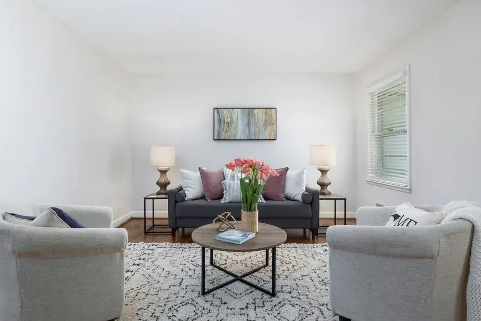
Pushing every piece of furniture against the wall (Image Credits: Pexels)
This is probably the single most common mistake, and it comes from a well-meaning place. People assume that shoving sofas and chairs to the perimeter opens up the middle of the room and makes it feel bigger. In practice, it does the opposite, creating a dead zone in the center that feels like a waiting room rather than a place anyone wants to sit and talk.
Interior designers have long pointed out that furniture placed too close to walls tends to make a room feel less inviting and less functional, since conversation and movement naturally happen in clusters, not around the edges. A living room needs a defined seating arrangement that pulls people toward each other, even if that means floating a sofa a few feet off the wall.
No clear focal point in the room
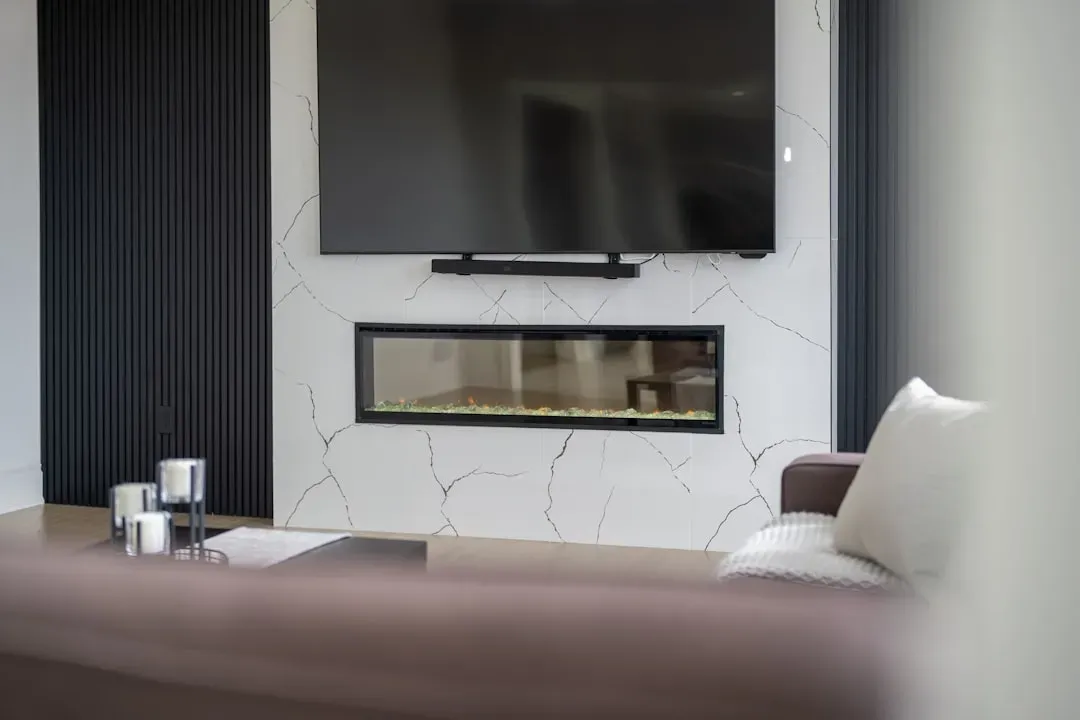
No clear focal point in the room (Image Credits: Unsplash)
Amateur layouts often try to give equal visual weight to everything at once, the TV, the window, the fireplace, a bookshelf, until nothing stands out and the eye doesn’t know where to land. A staged room needs one clear anchor, whether that’s a fireplace, a large window with a view, or a piece of art, and the furniture should be arranged around it.
Without that anchor, buyers wander into a space and feel a low-grade confusion they can’t quite name. They won’t say “the layout lacks a focal point,” they’ll just say the room felt off, and move on to the next listing.
Blocking natural walkways with furniture
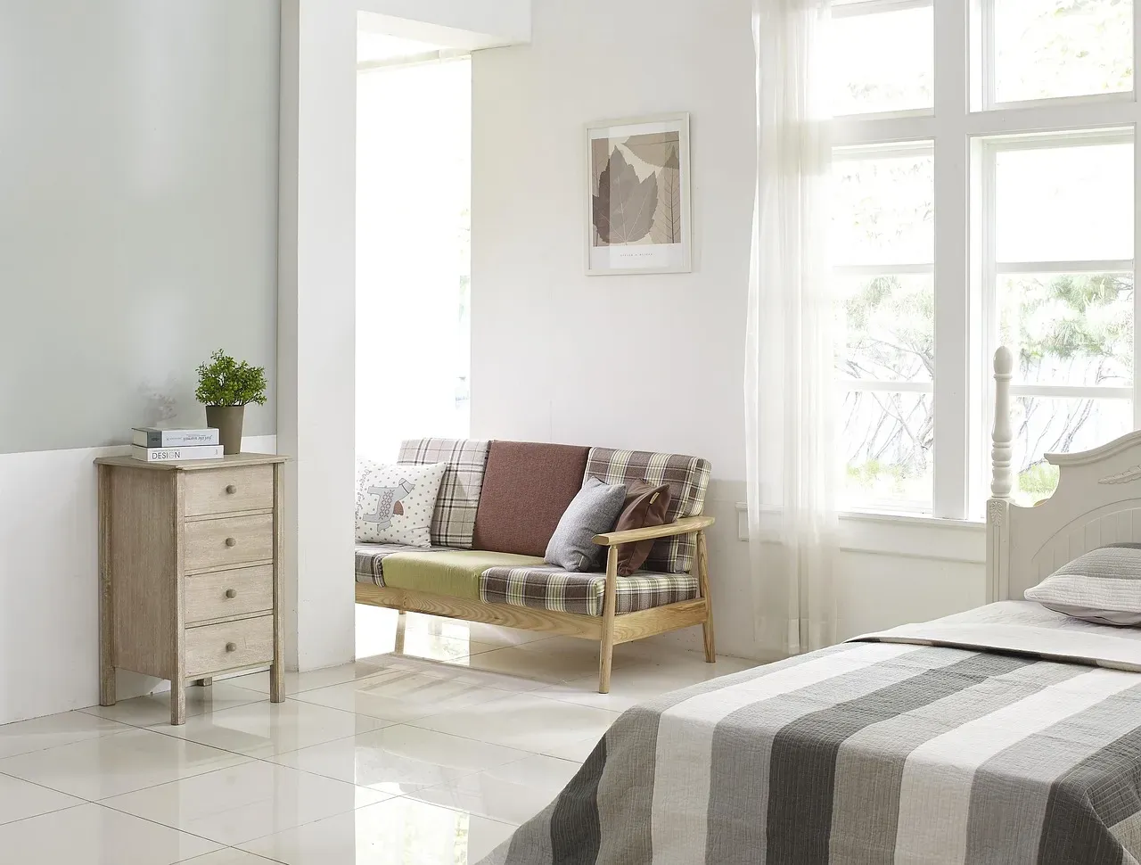
Blocking natural walkways with furniture (Image Credits: Pixabay)
It sounds obvious, but it happens constantly. A coffee table placed too far from the sofa, an ottoman parked directly in the path between the entry and the kitchen, a side table jutting into the main walkway. These choices force visitors to awkwardly navigate around obstacles instead of moving through the space naturally.
Good flow means a person should be able to walk from one end of the room to another without turning sideways or stepping over anything. When a layout ignores this, buyers subconsciously register the room as cramped, even if the square footage says otherwise.
Oversized furniture that swallows the room
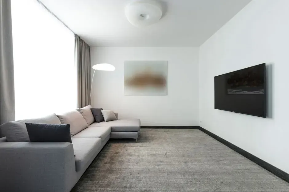
Oversized furniture that swallows the room (Image Credits: Pexels)
A sectional built for a family room in a suburban house does not belong in a compact city apartment’s living room, yet it happens all the time. Oversized furniture is one of the fastest ways to make a room feel smaller than it is, because it eats up the negative space that helps a room breathe visually.
Scale matters enormously in staging. A loveseat and two accent chairs will almost always read better in a modest living room than a single oversized sectional, because the eye has room to move and the proportions feel balanced rather than crowded.
Facing all seating toward the television
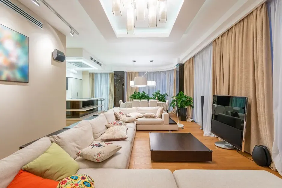
Facing all seating toward the television (Image Credits: Pexels)
This is a leftover habit from how many people actually live day to day, but it reads poorly in a staged home. When every chair and sofa cushion points at a mounted TV, the room signals “media room” rather than “living room,” and it strips away the sense that this could be a place for conversation or entertaining.
Staged rooms tend to perform better when seating is arranged in a loose circle or L-shape that encourages face-to-face interaction, with the television treated as a secondary element rather than the organizing principle of the entire room. Buyers are trying to picture hosting friends or family, not just streaming shows alone.
Ignoring the room's natural traffic pattern
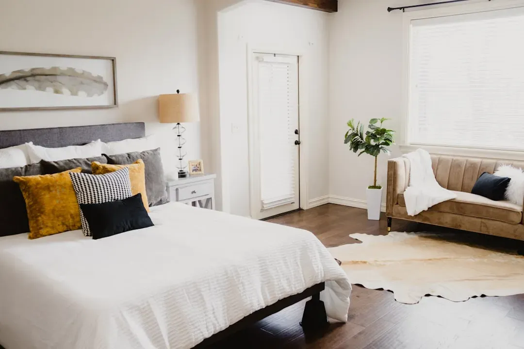
Ignoring the room's natural traffic pattern (Image Credits: Unsplash)
Every room has an obvious path people take through it, usually dictated by doorways, hallway entries, and connections to adjacent rooms. Amateur staging often ignores this entirely, placing furniture as if the room were a blank box rather than a space with built-in circulation.
The fix isn’t complicated, but it does take a walk-through before committing to a layout. Standing in each doorway and imagining how someone would actually move through the space reveals problems that aren’t visible from a single vantage point, like a chair angled just enough to clip an elbow on the way past.
Overcrowding with too many small pieces
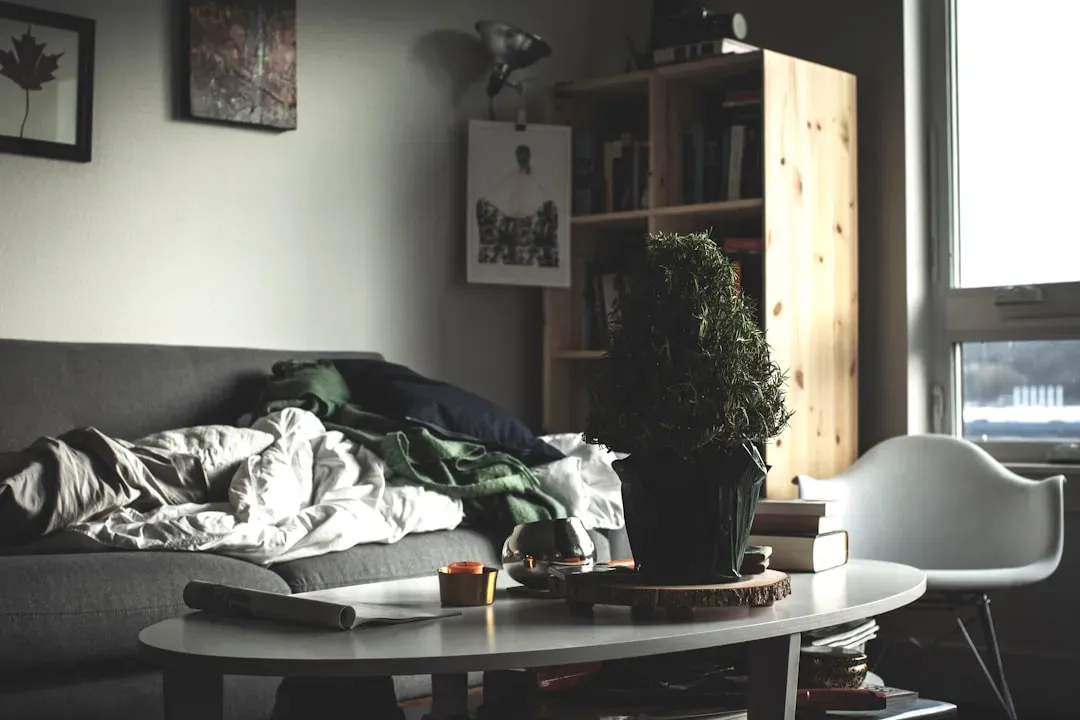
Overcrowding with too many small pieces (Image Credits: Unsplash)
Filling a living room with several side tables, extra ottomans, a bar cart, a magazine rack, and three throw pillows per cushion might feel cozy to the homeowner, but it reads as cluttered to a buyer walking through quickly. Every additional object is one more thing pulling attention away from the architecture and the actual dimensions of the room.
Staging works best when it shows restraint, using fewer, more intentional pieces rather than trying to demonstrate every possible use of the space at once. A room with breathing room between furniture pieces consistently photographs and feels more spacious than one packed with accessories.
Floating a rug that's too small
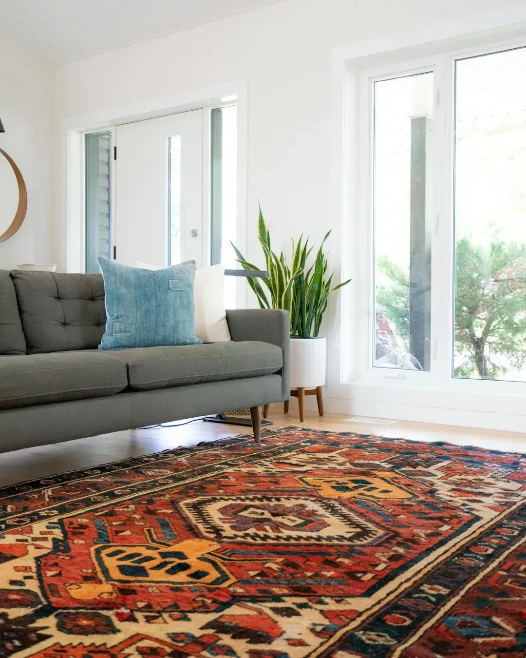
Floating a rug that's too small (Image Credits: Unsplash)
An undersized area rug is a layout mistake that’s easy to miss because it seems like a minor detail, but it visually shrinks a room in a very specific way. When a rug is too small, furniture legs end up half on and half off it, or entirely off it, which breaks up the visual field into disconnected pieces rather than one cohesive area.
The general rule staging professionals rely on is that at minimum the front legs of major seating pieces should rest on the rug, ideally all four legs where the room allows it. Getting this wrong is subtle, but buyers register the imbalance even if they can’t articulate exactly why the room feels slightly disjointed.
Symmetrical arrangements that feel stiff
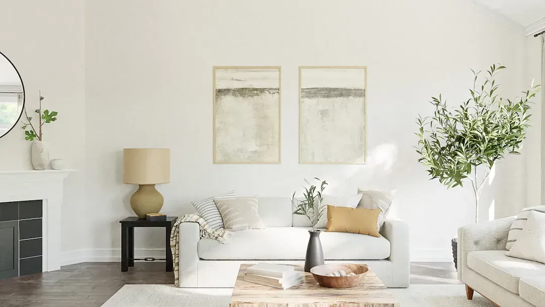
Symmetrical arrangements that feel stiff (Image Credits: Unsplash)
Perfect mirror-image symmetry, two identical chairs facing an identical pair of side tables, a sofa dead center against a wall with matching lamps on either end, can look tidy in theory but often feels sterile in person. It signals a showroom rather than a lived-in space, and buyers are ultimately trying to imagine their own life happening in that room.
A more effective approach mixes some symmetry with intentional asymmetry, like pairing a sofa with two different but complementary accent chairs instead of a matching set. This creates visual interest and warmth without tipping into chaos, striking a balance that reads as curated rather than rented.
Not accounting for lighting when placing furniture
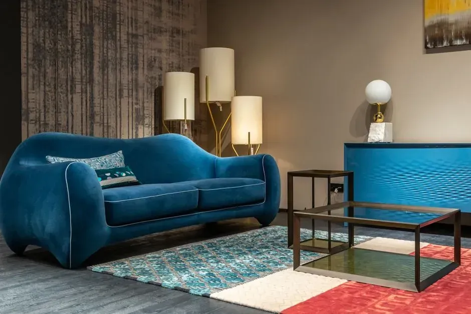
Not accounting for lighting when placing furniture (Image Credits: Pexels)
Furniture layout and lighting are more connected than most people realize. Placing a dark reading chair in the one corner of the room that never gets natural light, or positioning a sofa so it casts a shadow across the main seating area in the evening, undermines an otherwise decent arrangement.
Staging that photographs and shows well factors in where the light falls throughout the day, positioning key pieces to take advantage of windows and layering in lamps for evening ambience. A living room that looks bright and welcoming in listing photos, taken at the right time of day with furniture that isn’t blocking the light source, tends to generate more interest during showings.