
Walk through enough open houses in 2026 and you start noticing a pattern. Certain rooms just feel harder to picture living in, and it usually comes down to what’s on the walls. Paint is cheap compared to almost any other home improvement, yet the wrong shade can quietly work against a seller for weeks.
Real estate data from Zillow’s Behavioral Science team, along with input from Sherwin-Williams color experts, has been tracking exactly which colors buyers respond to and which ones make them scroll past a listing. Some of the results are surprising, and a few longtime “safe” choices no longer look so safe.
1. Ochre yellow
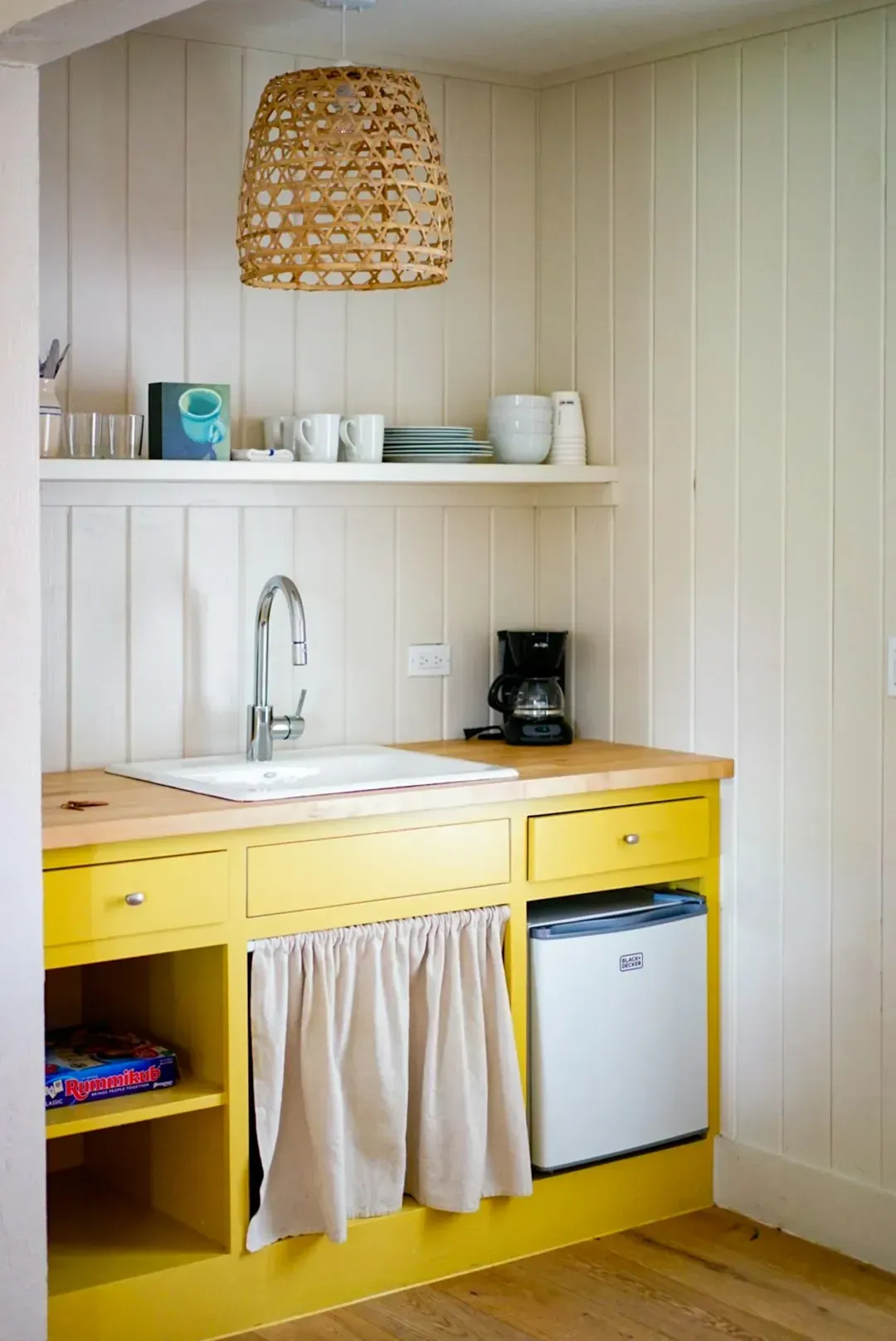
1. Ochre yellow (Image Credits: Unsplash)
If there’s one color agents are actively telling sellers to avoid this year, it’s ochre yellow. Zillow estimating that homes painted in the shade could receive offers more than $18,000 lower than comparable homes with more buyer-friendly colors, with kitchens painted ochre yellow alone reducing offers by more than $6,600. That’s an enormous swing for a single color choice.
The issue seems to be how dated and heavy the tone reads in photos. In the kitchen specifically, the range between the best and worst colors is nearly $8,000, from charcoal gray at plus $1,373 to ochre yellow at minus $6,630, making it the highest stakes room for color decisions. Buyers scrolling through listing photos tend to click past a mustard-toned kitchen without a second thought.
2. Daisy yellow
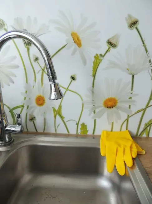
2. Daisy yellow (Image Credits: Pexels)
Yellow in general has a rough track record in resale data, and daisy yellow is a repeat offender. Recent and prospective buyers would pay nearly $4,000 less for a home with a daisy yellow kitchen, about $3,915 less, or living room, about $3,891 less. That’s not a small dent when a seller is trying to maximize offers in a competitive market.
Sellers often assume a cheerful color will read as warm and welcoming, but the data suggests otherwise. Bright yellow tends to feel busy on camera and hard to match with furniture, which pushes buyers to imagine repainting before they even move in. That mental repainting project, fairly or not, gets subtracted from the offer.
3. Fire hydrant red
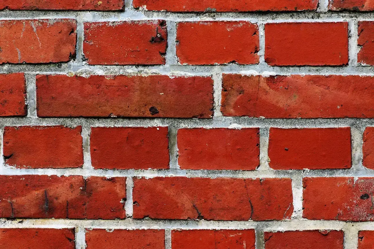
3. Fire hydrant red (Image Credits: Pixabay)
Bold red walls might look striking in person, but they photograph poorly and read as aggressive to most buyers. Zillow says that it’s also time to repaint a fire-hydrant red bathroom before listing, since this overwhelming color could cost about $8,000. That’s a steep price for a color choice many sellers picked years ago for a totally different reason.
The pattern holds outside the bathroom too. Buyers would pay nearly $2,000 less for a home with a fire hydrant red living room, about $1,820 less, or bedroom, about $1,987 less. Red simply asks too much emotionally from someone who’s just trying to picture their own furniture in the space.
4. Pale pink and Millennial pink
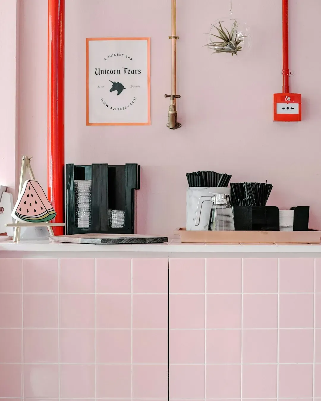
4. Pale pink and Millennial pink (Image Credits: Unsplash)
The soft pink trend that dominated home décor for years has cooled considerably in resale terms. Pale pink is a color that buyers don’t want to see when they’re touring a home, with a pale pink bathroom potentially losing up to $6,013 and a pale pink kitchen shaving an extra $4,201 off potential offers. Those numbers add up fast if pink shows up in more than one room.
It’s worth noting the color itself isn’t inherently bad, it’s the context. A soft blush accent wall styled well is different from a full room saturated in the tone. Buyers seem to associate an all-pink room with a very specific personal taste that’s hard to picture past.
5. Terra cotta and orange living rooms
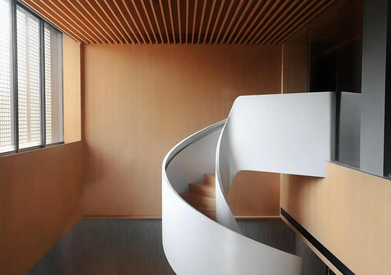
5. Terra cotta and orange living rooms (Image Credits: Pixabay)
Orange tones, especially the warm terra cotta family, haven’t fared well in resale studies. Zillow found that the worst living room shade is orange, with homes featuring terra-cotta-colored living rooms selling for an average of $793 less than other homes. It’s a smaller hit than some of the other colors on this list, but it’s consistent.
Terra cotta can work beautifully as an accent in the right home, particularly in warmer climates with Southwestern architecture. As a dominant living room color, though, it tends to clash with the neutral furniture most staged homes rely on, leaving buyers picturing an expensive do-over.
6. Dark, Tuscan-style brown bathrooms
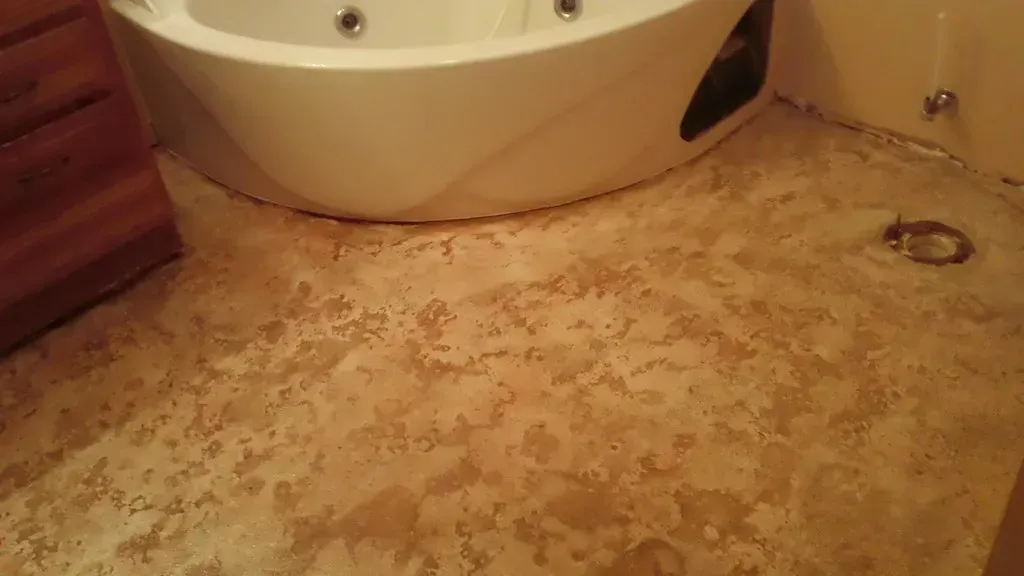
6. Dark, Tuscan-style brown bathrooms (Decorative Concrete Kingdom, Flickr, <a href="https://creativecommons.org/licenses/by/2.0/" target="_blank" rel="noopener">CC BY 2.0</a>)
Deep, saturated brown once had a moment in bathroom design, especially during the Tuscan-inspired trend of the 2000s. That moment has clearly passed. Zillow found that dark brown bathrooms, think of Tuscan style shades, sell for an average of $469 less than other homes.
The gap is smaller than some other colors on this list, but it’s a telling one. Bathrooms are small, often windowless spaces, and a heavy dark tone can make them feel even tighter in photos. Buyers touring in person often comment that the room feels dated the moment they walk in.
7. Stark, cool gray interiors
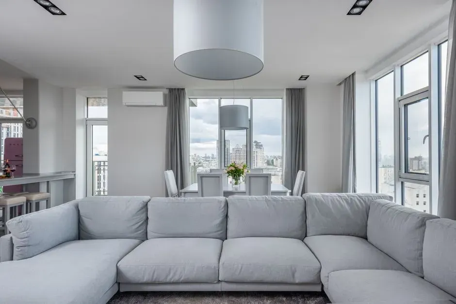
7. Stark, cool gray interiors (Image Credits: Pexels)
Cool gray dominated interior design for the better part of a decade, but the market has clearly moved on. For the past decade, paint color trends hovered around classic neutrals like gray, white, beige, and greige, as builders and buyers alike shifted their color preferences toward minimalism more so than maximalism, embracing muted tones that, while timeless, lacked panache.
The problem now is that a home painted in that older, flatter gray palette can look instantly out of step next to listings using warmer, richer tones. Zillow’s 2026 Paint Color Analysis found that today’s buyers prefer warm, grounded colors over stark, all-white interiors, and cool gray tends to get lumped into that same “flat” category buyers are actively moving away from.
8. Yellow exteriors
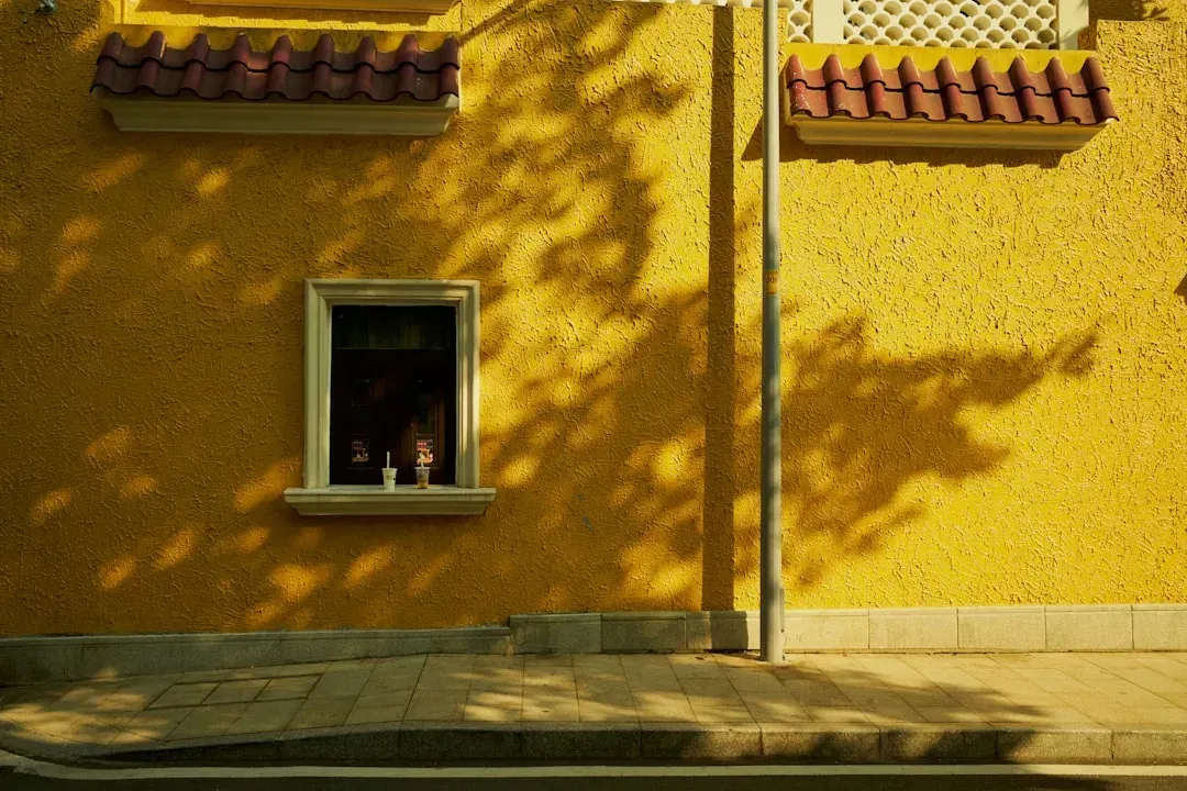
8. Yellow exteriors (Image Credits: Unsplash)
Curb appeal issues don’t stop at the front door, and yellow exteriors have consistently underperformed in Zillow’s data. Zillow’s Paint Color Analysis found that yellow exteriors were associated with sale prices roughly $3,400 lower than similar homes. Given how much weight first impressions carry in online listings, that’s a costly detail to get wrong.
Part of the issue is practical rather than aesthetic. Today’s buyers screen homes digitally before scheduling a showing, and listing photos and street view previews have become the new curb appeal. A yellow exterior that once seemed cheerful in person can look jarring or overly bright in a thumbnail image scrolled past on a phone.
9. Medium brown or tan exteriors
9. Medium brown or tan exteriors (Image Credits: Unsplash)
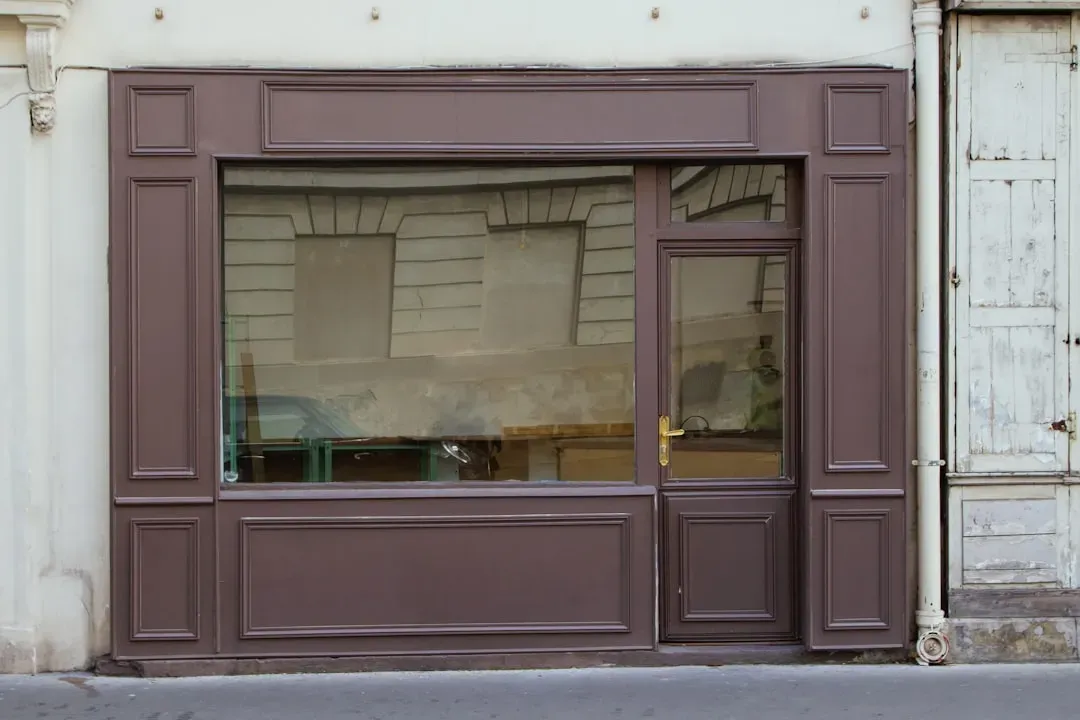
Brown and tan exteriors were once considered a safe, neutral choice, but they’re now losing ground to warmer, more blended tones like greige. Zillow’s data found greige exteriors sold for $3,496 more than medium brown or tan alternatives, a direct reflection of its broad buyer appeal. That’s a meaningful gap for something as simple as swapping one neutral for another.
The explanation ties back to versatility. Greige bridges traditional and contemporary buyer preferences at the same time, so a buyer who loves a classic colonial and a buyer who wants a modern farmhouse can both respond to a well executed greige exterior. Straight brown or tan doesn’t flex the same way across buyer tastes.
10. Defaulting to plain white throughout
10. Defaulting to plain white throughout (Image Credits: Unsplash)
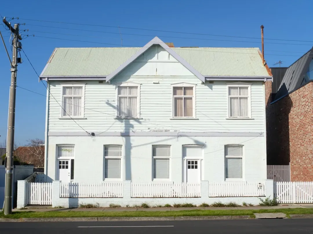
This one surprises a lot of sellers, since white has been the go-to “safe” color for staging for years. The data now suggests that safety has a cost. Fresh paint is a low lift improvement that can have an outsized impact on the sale price, but defaulting to white could leave money on the table.
The shift isn’t about white being bad exactly, it’s about it being neutral to the point of forgettable. The 90s are back, and that trend extends to home design, with chocolate brown emerging as the highest value color in this year’s study. A home painted entirely white in a market full of warmer, richer listings can end up looking sterile rather than move in ready, and that impression tends to translate into slower offers.
Final thoughts
Final thoughts (Image Credits: Pixabay)
None of this means a seller has to gut renovate their color scheme overnight. Most of these findings point to specific rooms and specific saturated shades rather than entire color families being off limits. A pale pink accent, for instance, behaves very differently than a fully saturated pink bathroom.
What the data does make clear is that paint is no longer a purely cosmetic decision when a home is heading to market. It’s one of the few variables a seller can control completely, and in 2026’s buyer environment, the difference between the right shade and the wrong one can add up to thousands of dollars and several extra weeks on the market.