
Walk into any grocery store and you’re stepping into a carefully engineered environment. Nothing about the layout, lighting, or product placement happens by accident. Retailers have spent decades studying how people move, look, and decide, and they’ve built stores around those patterns to nudge shoppers toward spending more than they planned.
Most of us know something feels a little off when we leave with three extra bags of items we never intended to buy, but we rarely stop to name exactly why. Here are twelve of the most common tactics stores use, the ones that shoppers grumble about most once they finally notice them.
1. Milk and eggs stashed in the back corner
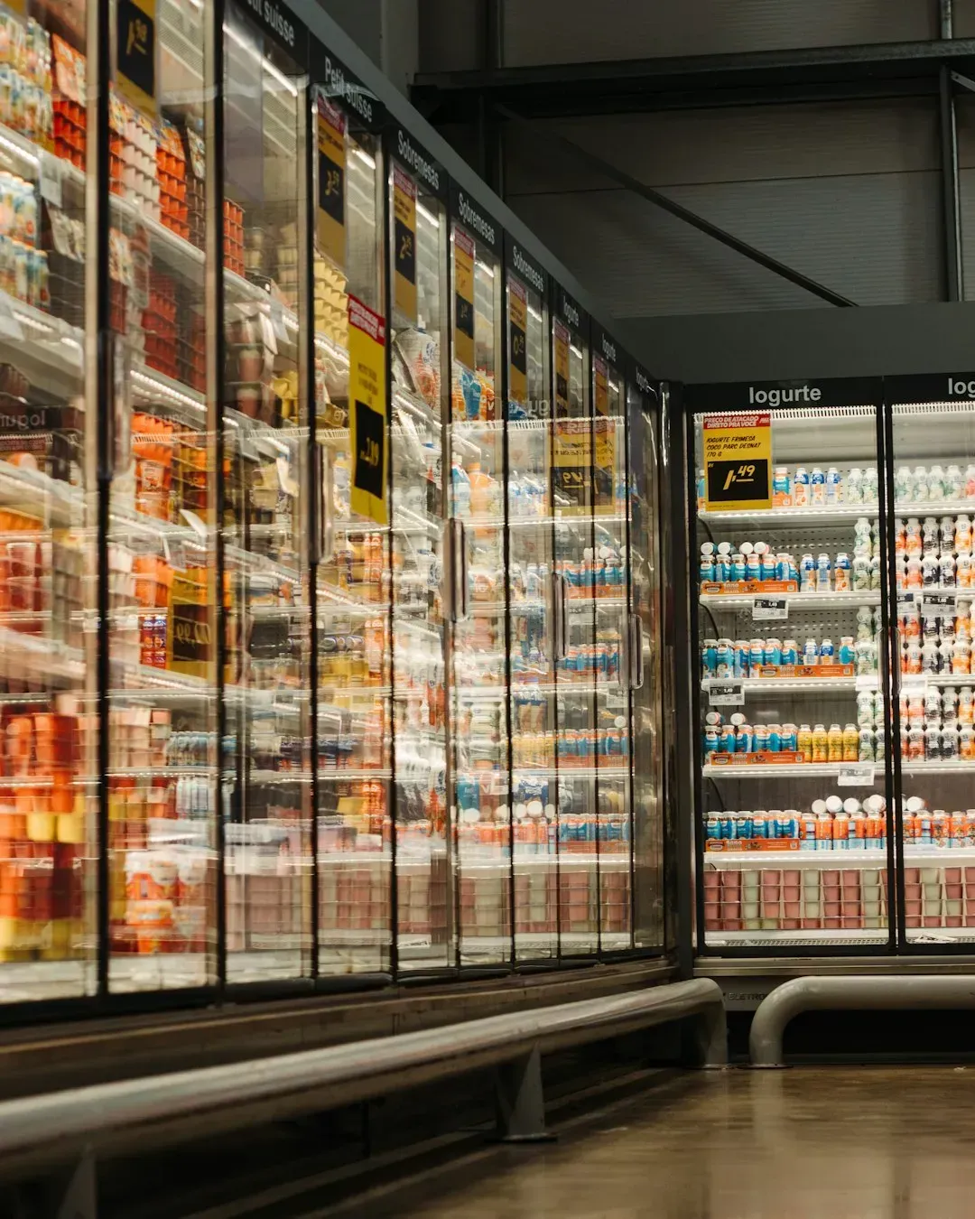
1. Milk and eggs stashed in the back corner (Image Credits: Unsplash)
Staples like milk, eggs, and bread are almost always placed at the very back of the store, forcing customers to walk past dozens of other displays just to grab the basics. This isn’t a layout accident. It’s a deliberate strategy to maximize the number of aisles a shopper passes and the number of impulse items they’re exposed to along the way.
By the time you reach the dairy case, you’ve likely already passed bakery smells, seasonal displays, and snack endcaps. Retail design consultants have long referred to this as the “milk run,” a pattern so consistent across chains that most regular shoppers barely question it anymore.
2. Shopping carts that just keep getting bigger
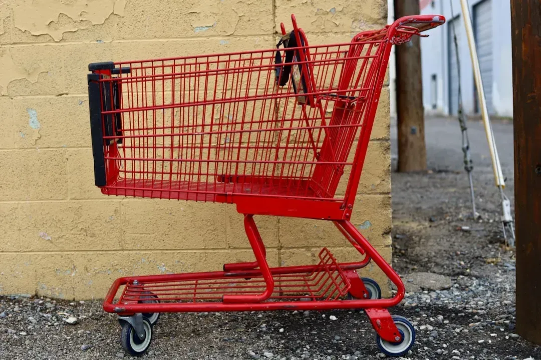
2. Shopping carts that just keep getting bigger (Image Credits: Unsplash)
Cart sizes have crept upward over the years, and it’s not because families are buying more per trip. Larger carts make a modest haul look sparse, which subtly encourages shoppers to keep tossing items in until the cart feels appropriately full.
Behavioral researchers have noted that people tend to fill whatever container they’re given, a phenomenon sometimes tied to the same psychology behind oversized plates leading to larger portions. A cart that looks half empty at checkout can feel like a signal to grab a few more things, even when the list is already complete.
3. Eye-level placement for the priciest brands

3. Eye-level placement for the priciest brands (Image Credits: Pexels)
Shelf space at eye level is prime real estate, and it’s rarely given away for free. Brands pay slotting fees to secure that prized middle-shelf position, which is why the name brand tends to sit right where your eyes naturally land while the store brand or lesser-known option gets pushed to the top or bottom shelf.
This isn’t just about visibility. Studies in consumer behavior consistently show that products at eye level get picked up more often simply because they require the least physical and mental effort to notice, regardless of whether they’re actually the better value.
4. Candy and gum lining the checkout lane
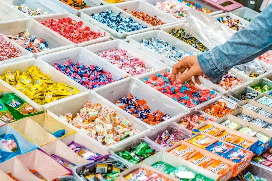
4. Candy and gum lining the checkout lane (Image Credits: Unsplash)
The checkout lane is essentially a captive audience zone. Shoppers are standing still, often a little bored, and their willpower has usually been worn down after twenty or thirty minutes of decision making throughout the store.
That’s exactly why candy bars, gum, and small impulse items cluster right at the register, positioned at a height that’s easy for both adults and kids to reach. Retailers know that decision fatigue peaks by checkout, making shoppers more likely to grab a last-minute treat without much deliberation.
5. Bakery aromas pumped through the ventilation
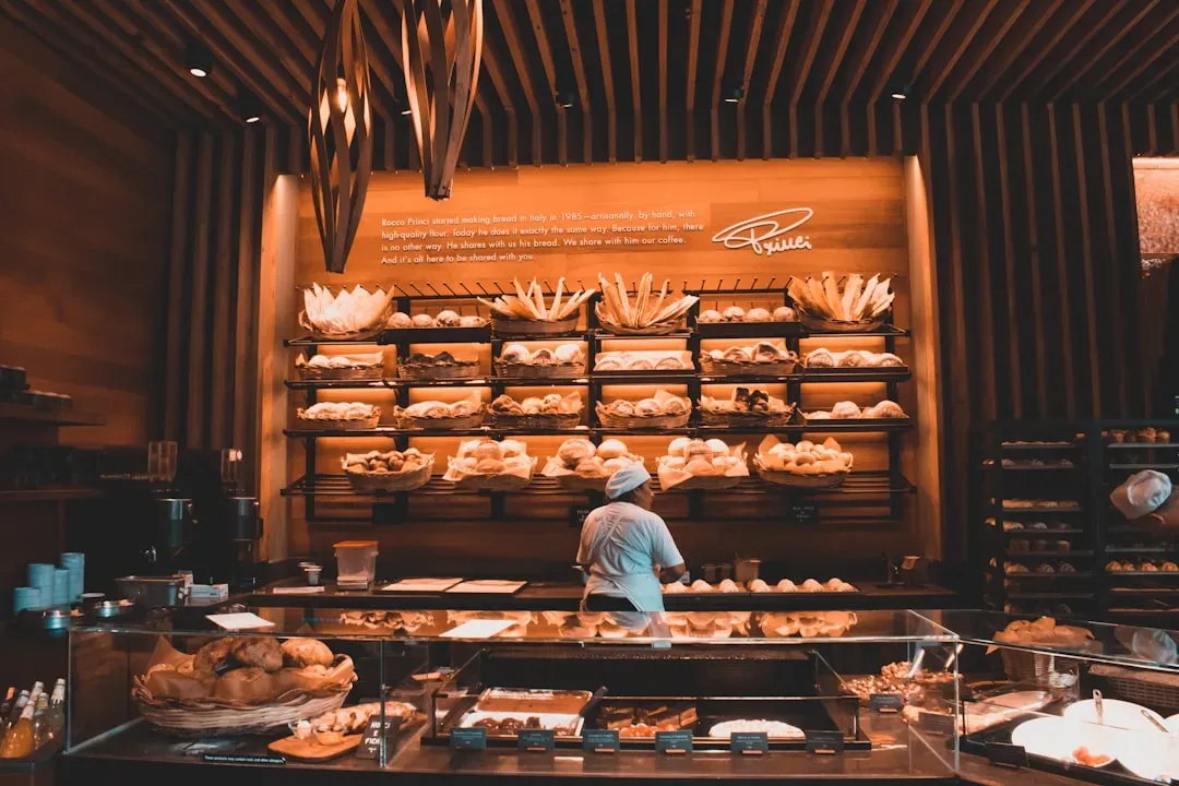
5. Bakery aromas pumped through the ventilation (Image Credits: Unsplash)
That warm bread smell that seems to greet you the moment you walk in isn’t always coming from ovens nearby. Many grocery chains use scent marketing, sometimes piping bakery aromas through ventilation systems specifically to trigger hunger and comfort associations before shoppers even reach the produce section.
Scent has a well-documented effect on purchasing behavior because it bypasses conscious analysis and taps directly into emotional memory. A hungry shopper tends to buy more broadly, not just more bread, which is precisely the point.
6. Produce placed right at the entrance
6. Produce placed right at the entrance (Image Credits: Pexels)
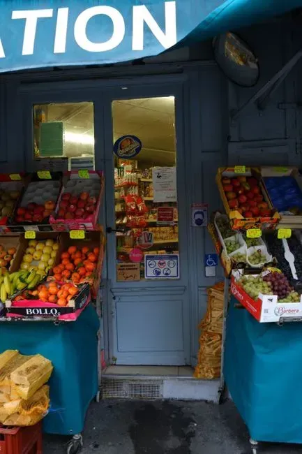
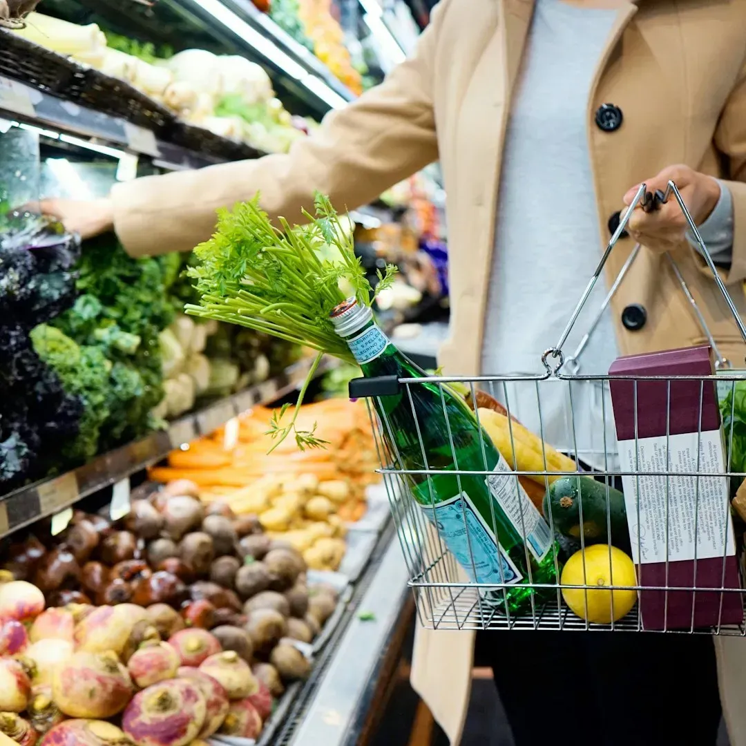
Fresh fruits and vegetables greet shoppers almost immediately in most stores, and the reasoning goes beyond simply showcasing healthy options. The vibrant colors and perceived freshness create an immediate positive impression, priming shoppers to feel good about the store and, by extension, more open to spending.
There’s also a psychological effect at play where starting with a “virtuous” purchase like vegetables can make people feel licensed to indulge later in the trip. Once that produce section builds a sense of goodwill, the chips and soda further along don’t feel quite as guilt-inducing.
7. Sale signs that aren't really sales
7. Sale signs that aren't really sales (Image Credits: Unsplash)
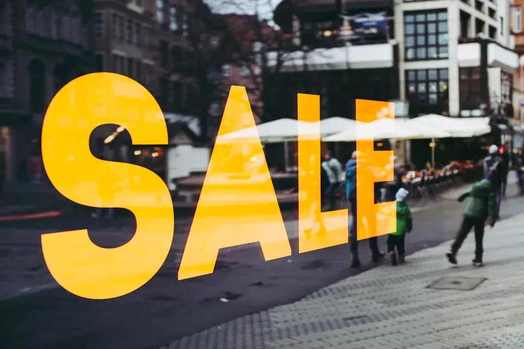
Bright yellow tags and bold “sale” lettering trigger an instinctive sense of urgency, but not every discounted-looking price reflects an actual price drop. Some items are simply priced at their regular cost but displayed with sale-style signage to create the impression of a deal.
Consumer advocacy groups have flagged this practice in various markets over the years, noting that shoppers often don’t compare a “sale” price against the item’s actual price history. Without checking a loyalty app or unit price sticker, it’s easy to assume a markdown that never actually happened.
8. Endcap displays that aren't tied to weekly deals
8. Endcap displays that aren't tied to weekly deals (Image Credits: Unsplash)
The displays at the end of aisles feel like they should always signal a special promotion, but that’s frequently not the case. Manufacturers pay for that prominent endcap space the same way they pay for eye-level shelving, meaning the product sitting there might be full price despite looking like a featured deal.
Shoppers who assume anything on an endcap must be discounted are exactly the audience this placement is designed to attract. Comparing the endcap price against the same product’s regular aisle price is often the only way to know whether it’s a genuine bargain.
9. Slower moving music during peak hours
9. Slower moving music during peak hours (Image Credits: Unsplash)
Background music in grocery stores is rarely random. Slower tempo music has been shown in retail psychology research to encourage shoppers to move more leisurely through aisles, which extends time spent in the store and increases exposure to more products.
Faster music tends to appear during busy rush periods to keep lines moving and encourage quicker turnover, while calmer, slower tracks dominate during quieter afternoon hours. It’s a subtle lever, but one that retail chains have used for years to shape shopping pace without shoppers noticing the shift.
10. Unit pricing that's hard to compare at a glance
10. Unit pricing that's hard to compare at a glance (Image Credits: Pexels)
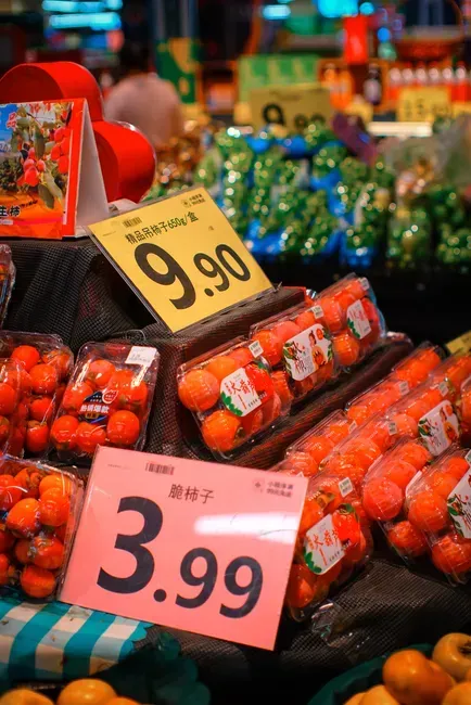
Unit pricing labels are supposed to help shoppers compare value across different package sizes, but the way they’re formatted can make quick comparisons surprisingly difficult. Different brands package similar products in odd sizes specifically to make direct math harder to do standing in the aisle.
A shopper comparing a twelve ounce jar against a nineteen ounce jar of the same brand isn’t doing simple division in their head most of the time. That friction benefits the store and brand more than it benefits the shopper trying to find the actual best deal per ounce or per unit.
11. Constant layout changes that force full store walks
11. Constant layout changes that force full store walks (Image Credits: Pexels)
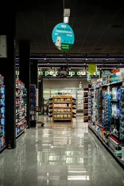
Just when a shopper memorizes where everything sits, many chains rearrange sections, seemingly for no obvious reason. This isn’t only about restocking logistics. Periodic layout shifts force even loyal, routine shoppers to walk through unfamiliar aisles again, increasing the odds they’ll notice and buy something they weren’t originally looking for.
Retail strategists have referred to this as breaking shopper autopilot, since habitual customers tend to develop tunnel vision toward their usual path. Shuffling shelves resets that pattern and effectively creates fresh impulse-buying opportunities out of routine trips.
12. Larger multi-buy deals that aren't always cheaper
12. Larger multi-buy deals that aren't always cheaper (Image Credits: Pexels)
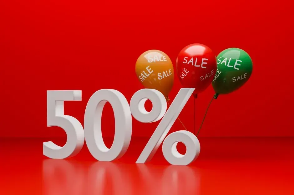
Deals like “buy two, get one” or “three for a set price” feel like guaranteed savings, but the math doesn’t always hold up when compared against a single unit’s regular price. Sometimes the bundled price per item is barely lower, or in rare cases even higher, than simply buying one at its standalone shelf price.
These multi-buy promotions work because bundling suggests bulk savings almost automatically in a shopper’s mind, reducing the instinct to actually check the math. Doing a quick per-unit comparison before grabbing the bundle is often the only way to know whether the deal is genuinely worth it or just dressed up to look that way.
None of these tactics are secret exactly, but most shoppers only clock a handful of them at any given time. Once you start noticing the cart size, the checkout candy, the endcap pricing, and the rest, it becomes a lot easier to shop with intention instead of on autopilot. A little awareness at the register tends to go further than any coupon ever could.